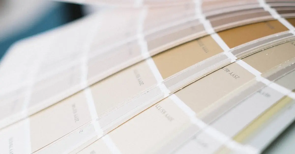
Colour Theory Basics+50 
Colour theory basics refer to the fundamental principles used to understand how colours interact, combine, and affect each other in visual arts and design. It includes concepts like the colour wheel, primary, secondary, and tertiary colours, as well as relationships such as complementary, analogous, and triadic schemes. Understanding these basics helps artists and designers create visually appealing and harmonious compositions, effectively conveying mood, emphasis, and balance in their work.
Colour Theory Basics+50
Colour theory basics refer to the fundamental principles used to understand how colours interact, combine, and affect each other in visual arts and design. It includes concepts like the colour wheel, primary, secondary, and tertiary colours, as well as relationships such as complementary, analogous, and triadic schemes. Understanding these basics helps artists and designers create visually appealing and harmonious compositions, effectively conveying mood, emphasis, and balance in their work.
💡 Key Takeaways
- Understand the color wheel and how primary, secondary, and tertiary colors relate.
- Distinguish warm vs cool colors and how they influence mood, depth, and contrast.
- Learn common color harmony schemes (complementary, analogous, triadic) and when to use them.
- Grasp color properties (hue, saturation, brightness) and how they affect readability and mood.
❓ Frequently Asked Questions
What is colour theory?
Colour theory is the study of how colours interact and how to combine them to create harmony, contrast, and readable designs.
What are the primary colours in additive and subtractive colour models?
Additive (light) uses red, green, and blue; subtractive (pigments) uses cyan, magenta, and yellow (often with black as K in printing).
What is a colour wheel and what are complementary colours?
A colour wheel maps colours around a circle; complementary colours sit opposite each other and provide high contrast when paired.
What are hue, saturation, and brightness (value)?
Hue refers to the colour family (red, blue, etc.), saturation is its intensity, and brightness/value is how light or dark the colour appears.
How do warm colours and cool colours affect mood and design?
Warm colours (reds, oranges, yellows) feel energetic and draw attention; cool colours (blues, greens, purples) feel calm and recede; use them to set mood and readability.