Red in Architecture
Red in architecture evokes strong emotions and creates a bold visual impact. It symbolizes energy, passion, and warmth, often used to draw attention or highlight specific elements within a design. Red can stimulate excitement and movement, making spaces feel dynamic and lively. When paired with green, it offers a striking contrast, balancing vibrancy with calmness, and enhancing both colors’ presence, resulting in visually compelling and memorable architectural environments.
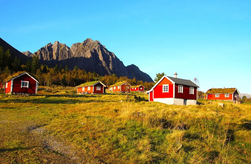
💡 Key Takeaways
- Understand how red affects mood, attention, and perceived space in architecture.
- Explore cultural and historical meanings of red across regions and time periods.
- Identify common red materials (brick, terracotta, red stone) and how they influence aesthetics and maintenance.
- Learn practical strategies for using red in interiors and exteriors, including lighting, contrast, and accessibility.
❓ Frequently Asked Questions
What does red symbolize in architecture across cultures?
Red often conveys power, luck, protection, or warmth depending on culture. In East Asia, red symbolizes good fortune and status; in other contexts it can signify importance or authority.
What materials create the red look in architecture?
Common red materials include brick, red clay tiles and terracotta, red sandstone, and red-painted surfaces or lacquer on wood.
How does red affect perception of space and mood?
Red is a warm, attention-grabbing color that can make spaces feel cozier or more monumental and can influence perceived proximity and scale based on shade and contrast.
What should designers consider when using red?
Consider cultural meanings, maintenance and fading from sunlight, potential heat absorption in darker reds, and preservation rules in historic contexts.