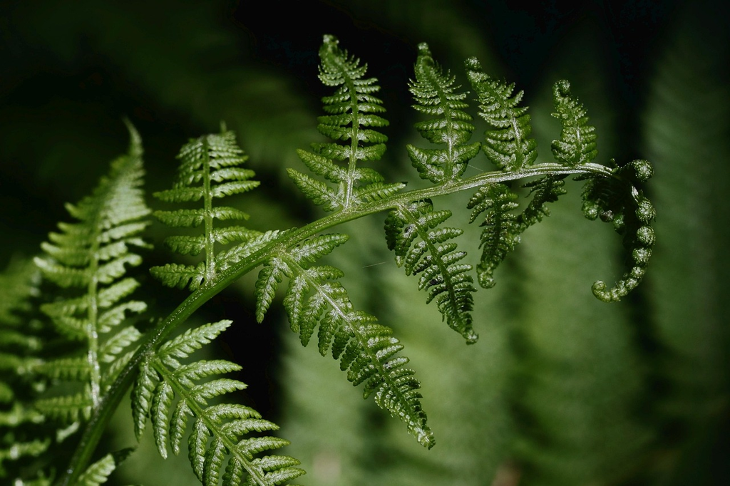
Shades of Green
"Shades of Green (Color Vibes (Red & Green))" refers to the various tones and intensities of the color green, each evoking different moods and feelings. When paired with red, the contrasting color, it creates a vibrant and dynamic visual effect. This combination often symbolizes balance, energy, and harmony, drawing attention due to the strong contrast between the cool, calming nature of green and the warm, stimulating vibe of red.
💡 Key Takeaways
- Identify common green shades and what makes each one distinct.
- Learn how to create different green variations by adjusting brightness and adding black or white.
- Explore the color psychology and cultural meanings of green to inform design choices.
- Apply green color effectively in design with accessibility considerations and contrast guidance.
❓ Frequently Asked Questions
What does 'shades of green' mean in color terms?
It refers to variations of green created by changing lightness and saturation or by mixing with other colors. A shade is a darker version (add black); a tint is lighter (add white); a tone is a muted version (add gray).
How can you mix greens to create different shades?
Start with yellow and blue for a base green. More yellow yields warmer, lighter greens; more blue yields cooler, deeper greens. Lighten with white; darken with a small amount of blue (avoid heavy black to prevent muddy hues).
What are some common green shades and their typical uses?
Emerald (bright, luxurious) for emphasis; Forest or Olive (earthy, calm) for nature or sustainability; Lime or Mint (fresh, energetic) for youth or health; Sage (muted) for a calm background.
How can you tell a green shade apart in design or nature?
Look at brightness (light vs dark) and saturation (vivid vs muted). In digital work, identify with hex or RGB values; in nature, greens shift with light—from yellow-green in spring to blue-green in shade.