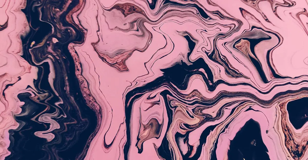
Color Mixing and Harmonies
Color mixing and harmonies refer to the principles and techniques used to blend different colors and create visually appealing combinations. By mixing primary colors, artists can produce secondary and tertiary hues, expanding their palette. Harmonies involve selecting colors that work well together, such as complementary, analogous, or triadic schemes, to achieve balance and unity in art and design. Understanding these concepts enhances creativity and visual impact.
💡 Key Takeaways
- Identify primary colors and how they mix to form secondary and tertiary hues.
- Explain common color harmonies (complementary, analogous, triadic, and monochromatic) and when to use them.
- Demonstrate simple color mixing techniques to create tints, shades, tones, and neutrals.
- Apply harmony principles to build cohesive palettes for arts and crafts projects.
❓ Frequently Asked Questions
What is color mixing?
Color mixing is blending colors to create new hues, often by combining primary colors to produce secondary and tertiary colors, expanding your palette.
How are secondary and tertiary colors formed from primary colors?
Secondary colors come from mixing two primaries (red+blue=purple, blue+yellow=green, red+yellow=orange). Tertiary colors are made by mixing a primary with an adjacent secondary (red-orange, yellow-green, blue-violet, etc.).
What are common color harmonies and what do they mean?
Color harmonies are pleasing color relationships, including complementary (opposite on the color wheel), analogous (adjacent colors), triadic (three evenly spaced colors), and monochromatic (variations of one hue).
How can you apply color harmony in your art?
Choose a harmony, limit your palette to a few hues, use the main color with supporting tones, and add small accents for contrast while considering value and saturation for balance.