Color Theory Basics
Color theory basics refer to the fundamental principles that guide the use and combination of colors in art and design. It includes understanding the color wheel, primary, secondary, and tertiary colors, as well as color relationships like complementary, analogous, and triadic schemes. These basics help create harmony, contrast, and visual interest. Knowledge of color theory is essential for effective visual communication and evokes specific emotions or responses in viewers.
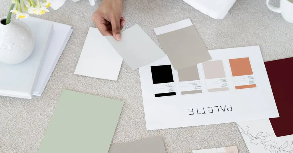
💡 Key Takeaways
- Identify the color wheel and classify colors as primary, secondary, and tertiary.
- Explain color relationships (complementary, analogous, triadic) and how to apply them in art and design.
- Understand warm vs cool colors and how to build harmonious palettes with mood and readability in mind.
- Apply color mixing concepts to create contrast, balance, and effective visual hierarchy in compositions.
❓ Frequently Asked Questions
What are the primary colors in art color theory?
In traditional pigment-based color theory, the primary colors are red, yellow, and blue. Mixing them yields secondary colors like orange, green, and violet.
What is a color wheel and what are secondary colors?
The color wheel is a circular map of hues showing relationships. Secondary colors are made by mixing two primaries: orange (red+yellow), green (blue+yellow), and violet (red+blue).
What are analogous and complementary color schemes?
Analogous schemes use colors next to each other on the wheel (e.g., blue-green). Complementary schemes use opposite colors (e.g., red and green) for high contrast.
What is a triadic color scheme?
A triadic scheme uses three colors evenly spaced around the wheel (e.g., red, blue, and yellow) for balanced contrast.
What is a tertiary color and how is it created?
A tertiary color is made by mixing a primary color with a neighboring secondary color (e.g., red-orange, yellow-green), expanding the palette.