Data Visualization as Art
Data visualization as art refers to the creative transformation of complex data into visually engaging and aesthetically pleasing representations. It blends scientific accuracy with artistic expression, making information more accessible and captivating. Through thoughtful use of color, form, and design, data visualizations can evoke emotions, tell compelling stories, and inspire deeper understanding, turning raw numbers into meaningful visual experiences that transcend traditional charts and graphs.
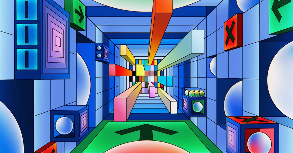
💡 Key Takeaways
- Understand how data visualizations translate complex data into accessible, aesthetically engaging visuals.
- Learn how color, shape, and layout influence interpretation and emotional impact.
- Explore how visuals balance accuracy with artistic expression in communicating information.
- Identify best practices for clear, ethical, and accessible data storytelling in art contexts.
❓ Frequently Asked Questions
What is data visualization as art?
It’s the creative transformation of data into visuals that are both informative and aesthetically engaging, blending scientific accuracy with artistic expression.
How does data visualization balance accuracy and aesthetics?
It preserves truthful data representation while using color, scale, and layout to highlight patterns and enhance readability without misrepresenting the data.
What roles do color, form, and composition play in data visualization?
Color encodes values or categories; form and layout reveal relationships and structure; composition guides attention and storytelling while maintaining clarity.
How is data visualization connected to art history and visual arts?
It draws on design principles, visual storytelling, and historical poster and infographic traditions from art history to organize information and create engaging visuals.